A month of Flutter: initial theme

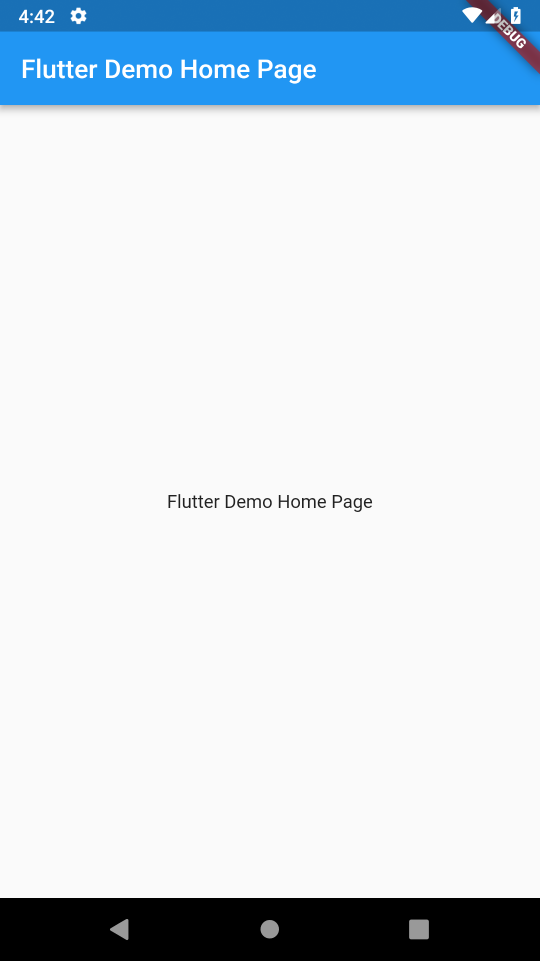
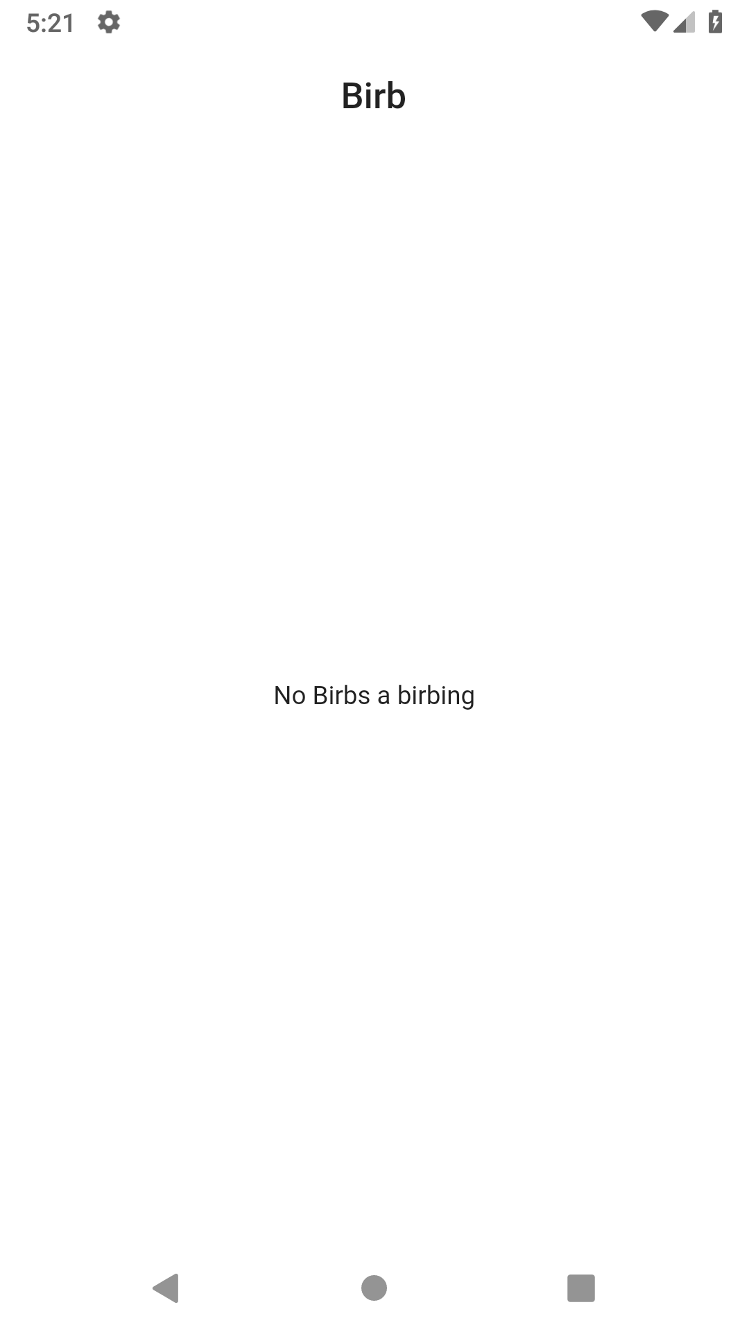
I don't have a full theme designed yet but I am planning on going in a clean and minimalist direction. So let's take the current default design and clean it up a little.

There are a couple of changes to the code for this theme cleanup. The first we'll cover is changing the status bar and navigation bar colors. The SystemChrome change will go in the main function. We'll also have to import services to get access to SystemChrome.
import 'package:flutter/services.dart';

void main() {
  runApp(MyApp());

  SystemChrome.setSystemUIOverlayStyle(
    const SystemUiOverlayStyle(
      statusBarColor: Colors.white,
      systemNavigationBarColor: Colors.white,
      systemNavigationBarDividerColor: Colors.black,
      systemNavigationBarIconBrightness: Brightness.dark,
    ),
  );
}
Note that a full restart of the app is needed for the system UI color changes.
The next change is customizing the theme on MaterialApp. These changes disable the debug banner, tell MaterialApp to be in light brightness mode, and set a few colors to white. The title is also changed to just Birb.
MaterialApp(
  debugShowCheckedModeBanner: false,
  title: 'Birb',
  theme: ThemeData(
    brightness: Brightness.light,
    primaryColor: Colors.white,
    scaffoldBackgroundColor: Colors.white,
  ),
  home: const MyHomePage(title: 'Birb'),
);
The next change is to center the title of the AppBar and remove it's elevation (shadow).
AppBar(
  title: Center(
    child: Text(widget.title),
  ),
  elevation: 0.0,
),
And the final change is to update and center the placeholder text. This will eventually turn into a widget to display when there are no images to show.
const Center(
  child: Text('No Birbs a birbing'),
)
Now we have this nice clean base theme to continue building on.

If you want to learn more about theming Flutter apps, check out the Building Beautiful UIs with Flutter codelab.