Refactoring Tailwind CSS React Apps with Twin.macro

Why Tailwind is awesome
TailwindCSS is taking the world by storm. It is essentially a set of composable, opinionated utility classes that allows for a consistent set of colors, spacings, sizes, shadows and more. Tailwind gives a developer or designer just enough constraint to effectively create a design, but not so much that it's not flexible enough to have to override a bunch of CSS to get things done. Tailwind has become so popular, that there are many official and unofficial places to find pre-made components which the end-user can tweak to their delight.
The massive community and vast landscape of available tailwind components gives a developer a running start in creating an application. Using tailwind with React is massively productive, but has its drawbacks which we will discuss below.
This post will not go into installing Tailwind and assumes that you're familiar with CSS, Javascript and React. Some knowledge of css in js is also helpful but not required.
There are a few wonderful official resources for getting started with React and Tailwind:
Why Tailwind is not perfect
Tailwind has many advantages due to it's constraints and philosophy of composition and flexibility over semantic classes, but it's not perfect. In my experience using tailwind over other frameworks like bootstrap and semantic-ui, I've run into several issues:
Utility Class Soup
One of the things that I absolutely love about Tailwind is that it's very easy fire up your project, open developer tools, add and remove utility classes, then immediately see a change. This sort of rapid development has become a boon to tightening up the feedback loop when I'm doing frontend work. Experiment with adding utility classes in the browser, copy and paste into code, save, and done!
While this is a great way to speed up development at first, over time, your overall design starts to fragment and you'll have slight differences on your similar elements. It's going to end up slowing you down in the long run, especially if your design is still fluid and ever-changing (which it often is early on in a project).
Top-Down Design Fragmentation
Design fragmentation with Tailwind is usually a problem when you're working as a team while working on "pages" before working on developing a vast component library. Often, development efforts will be focused on full pages or large components before building up a library of smaller components. This sort of fragmentation isn't as much of an issue in semantic-class frameworks like bootstrap or semantic-ui because elements like h1 are already styled, and layouts are already created and spaced out for you. When designing entire pages, it's easy for one developer to throw utility classes on a div to lay things out one way, then another developer on the same team could create a similar but slightly different layout on a different page. This makes it hard to change these layouts and design decisions in the future, as every page will have to be changed due to the utility classes being contained on a bunch of different pages. This is an obvious example of doing things the "wrong way" but it can and does happen, and it is never fun to fix due to the tedious nature of having dozens of classes on elements.
In order to combat this issue, design from the bottom-up. Create your elements like headings, typography sizes and styles, layout sizing, etc. as small components FIRST before touching any page which integrates these components. It feels "slower" to work this way, but I promise you that you will thank me later, as trying to change pages and pages of "utility class soup" is not fun. Trust me, I have been there.
Dynamic Classnames are a problem
As a React developer, you may be used to creating styles and classnames by using template literals to generate full names out of parts and variants of other classnames.
Example:
<section className={`text-${error ? 'red' : 'green'}-600`}></section>
This will not work because Tailwind uses PurgeCSS in production to decrease the size of the CSS payload. This can be surprising because it works fine in development due to no PurgeCSS. Deploy to production and bam! you have a broken design.
The easiest way to work around this problem is to write the full classname in the file (text-red-500 and text-green-500 for this example). So that PurgeCSS can see it and know to include it in the final production payload.
Read more about how Tailwind and PurgeCSS work together here.
Reusability is not always as easy as it seems
Let's say that you have been a disciplined developer - you have kept all of your basic elements in separate components, have written purge-able css, and have stuck to your design. Good job! You're 90% of the way to a maintainable design. The only problem is that we still have a lot of utility classes cluttering up code that we're looking at every day. Wouldn't it be nice if we could tuck these out of the way and just focus on our design? What do we do when we need variants of a component? Do we write a bunch of if-then or case statements to select which utility classes to apply to our component? If that seems messy to you, you are right!
Lucky for us, there are solutions to this quandary that we often find ourselves in.
Twin.macro to the rescue
This post is going to focus on my favorite way to clean up Tailwind components: Twin.macro. Before diving head on into twin, it's important to ensure that you have a componentized design which welcomes change. The official tailwind docs goes into detail about how to go about this. It's a wonderful start, but doesn't really solve our desire to have presentation tucked away from code in our React components.
Twin.macro is my favorite solution because it's very flexible and allows you to use whatever css-in-js library that you're comfortable with. You may already even have one of these in your project:
Twin.macro is a library for using css-in-js with Tailwind and React. It pre-procceses your classnames with babel at compile-time and turns them into CSS objects, which in turn go into your css-in-js library of choice.
Why twin.macro?
The official site says it best but I will summarize my favorite features here:
- Simple to import
- Gives suggestions to typo mistakes you may have made when selecting Tailwind utility classes
- Easy to mix in vanilla css or even sass-syntax styles into your components
- It's very fast and doesn't add any code to your bundle since it's pre-processed at compile-time.
- Makes it incredibly easy for components to support variants (think
<Button small> <Button large>, etc.)
I could go on and on about the things that I like about twin.macro, but I think that an illustrative example would be best.
Twin.macro Examples
Here's an image of 2 identical cards that I made for a tech talk with Tailwind and React:
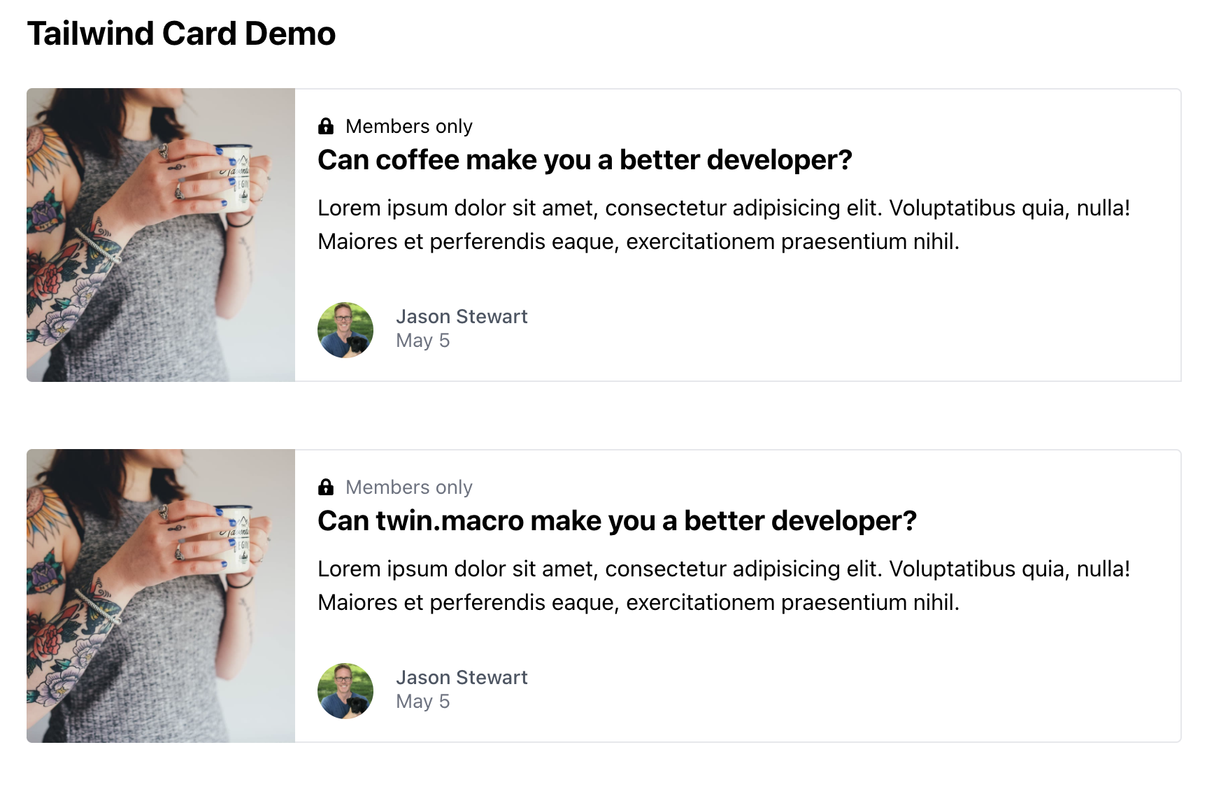
The first card is mostly made up of Tailwind utility classes:
import React from 'react';
import LockImage from './LockImage';
import ProfileImage from './ProfileImage';

const Card = () => (
  <div className="w-1/2 lg:flex">
    <div
      className="h-48 lg:h-auto lg:w-48 flex-none bg-cover rounded-t lg:rounded-t-none lg:rounded-l text-center overflow-hidden"
      style={{
        backgroundImage: "url('https://tailwindcss.com/img/card-left.jpg')",
      }}
      title="Woman holding a mug"
    ></div>
    <div className="border-r border-b border-l border-grey-light lg:border-l-0 lg:border-t lg:border-grey-light bg-white rounded-b lg:rounded-b-none lg:rounded-r p-4 flex flex-col justify-between leading-normal">
      <div className="mb-8">
        <p className="text-sm text-grey-dark flex items-center">
          <LockImage />
          Members only
        </p>
        <div className="text-black font-bold text-xl mb-2">
          Can coffee make you a better developer?
        </div>
        <p className="text-grey-darker text-base">
          Lorem ipsum dolor sit amet, consectetur adipisicing elit. Voluptatibus
          quia, nulla! Maiores et perferendis eaque, exercitationem praesentium
          nihil.
        </p>
      </div>
      <div className="flex items-center">
        <ProfileImage />
        <div className="text-sm">
          <p className="font-medium text-gray-600 leading-none">
            Jason Stewart
          </p>
          <p className="text-gray-500">May 5</p>
        </div>
      </div>
    </div>
  </div>
);

export default Card;
The second card is refactored with components generated from twin.macro:
import React from 'react';
import LockImage from '../LockImage';
import ProfileImage from '../ProfileImage';
import {
  CardContainer,
  CardContent,
  CardImage,
  CardText,
  CardTitle,
  Date,
  Name,
  ProfileImageContainer,
  Wrapper,
} from '.';

const TwinCard = () => (
  <Wrapper>
    <CardImage
      style={{
        backgroundImage: "url('https://tailwindcss.com/img/card-left.jpg')",
      }}
      title="Woman holding a mug"
    />
    <CardContent>
      <div className="mb-8">
        <CardContainer>
          <LockImage />
          Members only
        </CardContainer>
        <CardTitle>Can twin.macro make you a better developer?</CardTitle>
        <CardText>
          Lorem ipsum dolor sit amet, consectetur adipisicing elit. Voluptatibus
          quia, nulla! Maiores et perferendis eaque, exercitationem praesentium
          nihil.
        </CardText>
      </div>
      <ProfileImageContainer>
        <ProfileImage />
        <div>
          <Name>Jason Stewart</Name>
          <Date>May 5</Date>
        </div>
      </ProfileImageContainer>
    </CardContent>
  </Wrapper>
);

export default TwinCard;
Notice how much more readable that the second card is. Just scanning over the code of the second example, it's immediately apparent what components are for layout and where the actual content is.
Here's the code for the components made in twin.macro (it's in the index.js file in the same directory as the card):
import tw from 'twin.macro';

export const Wrapper = tw.div`w-1/2 lg:flex`;
export const CardImage = tw.div`h-48 lg:h-auto lg:w-48 flex-none bg-cover rounded-t lg:rounded-t-none lg:rounded-l text-center overflow-hidden`;
export const CardContent = tw.div`border-r border-b border-l border-gray-200 lg:border-l-0 lg:border-t lg:border-gray-200 bg-white rounded-b lg:rounded-b-none lg:rounded-r p-4 flex flex-col justify-between leading-normal`;
export const CardContainer = tw.p`text-sm text-gray-500 flex items-center`;
export const CardTitle = tw.h1`text-black font-bold text-xl mb-2`;
export const ProfileImageContainer = tw.div`flex items-center text-sm`;
export const Name = tw.p`font-medium text-gray-600 leading-none`;
export const Date = tw.p`text-gray-500`;
export const CardText = tw.p`text-base`;
Much, much cleaner! The presentation of these components is tucked away from the actual logic, and content, leading to more maintainability. Keep in mind that this is a contrived example, and in a larger application buttons, containers, and other components would most likely be part of a more complex directory hierarchy.
Injecting Sass Styles Into Components
Since we're using Tailwind to style our components, we cannot use sass, can we? Well yes we can… Sort of. We can mix sass-syntax styles into our components:
export const TwHeading = tw.h1`font-bold text-2xl my-3 mx-6`;

const hoverStyles = css`
  &:hover {
    border-color: black;
    ${tw`text-gray-400 border-b`}
  }
`;

export const SassHeading = ({ children }) => (
  <TwHeading css={[hoverStyles]} children={children} />
);
Pretty cool! This is a contrived example, but sometimes it's way easier to style something in sass (especially when you're using off-the-shelf components from other libraries).
Creating component variants
Sometimes it's useful to be able to create a component that's a large version, small version, blue version, well… you get the point. Variants can be easy to create by passing in props, but then again we're mixing logic with presentation.
Twin makes it a breeze to create variants:
export const GeocitiesHeading = ({ children, uglyBackground }) => (
  <TwHeading
    css={[tw`text-indigo-400`, uglyBackground && tw`bg-green-800`]}
    children={children}
  />
);
Above you see an example of an intentionally ugly component. We can make it even uglier by giving it a uglyBackground variant:
<GeocitiesHeading>This is a retro 90's heading</GeocitiesHeading>
<GeocitiesHeading uglyBackground>
  This is a 90's retro heading with a gross background
</GeocitiesHeading>
Let's say, for some unknown reason that we want to make an even weirder, unreadable variant:
export const GeocitiesHeading = ({ children, uglyBackground, unreadable }) => (
  <TwHeading
    css={[tw`text-indigo-400`,
          uglyBackground && tw`bg-green-800`,
          unreadable && tw`bg-black text-black`]}
    children={children}
  />
);

<GeocitiesHeading unreadable>This is a secret</GeocitiesHeading>
Of special note is that this way of creating variant components is a very good solution to the "don't interpolate utility classes" issue with PostCSS.
Summary
There is so much that you can do with twin.macro, that this post barely scratches the surface. I encourage you to try it out for yourself and see the magic firsthand.
I've got a demo application that showcases the examples that I used in this post:
git clone https://github.com/bendyworks/tailwind-twin-demo
cd tailwind-twin-demo
yarn start
open http://localhost:3000
Resources
Image Attribution
Lanju Fotografie on Unsplash